
So this is a topic I've avoided for awhile, because I'll admit, I'm a bit biased on the matter. As an artist, I can be a strong judge of book covers, and while I do read books with bad ones, it is always rare and they always fall below other books on my reading list. A book is your first impression with me as a reader, and content doesn't matter if you can't get someone to open your book. Authors are in risky territory because often what they are being judged on first is someone else's work: the cover art.
Believe it or not, a 'bad' book cover isn't always someone with a homemade picture or a terrible font choice. Covers can be ruined in many other ways, with the wrong image choices, image placing, and more. My point in writing this post is to help shed some light on what can make a bad cover, but also some of the ways these things can be avoided. If you hire an artist, be aware of what they're doing: ask questions, and be informed.
Below are a few of my book cover 'worst offenders'. Please note: all the examples used are cover examples only. I am going to be a bit critical here, but I am looking at covers alone. I have not read the books and this is not a rating of their contents.
Offender Number One: Copyright Copycats
Believe it or not, even good looking covers can be troublesome. The following was a book I found on Amazon just this week. While it looks clean, easy to read, and interesting, there is a big problem with this book: the symbols. Recognize them? If you've ever watched Avatar: The Last Airbender you would. This is clearly, line for line, a water-bending symbol.

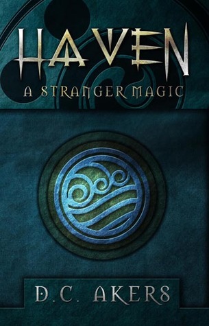
To give the benefit of the doubt, maybe this symbol was used before Avatar. Maybe they even got permission to use it. The problem here is the risk of copyright infringement. Avatar is a popular show, and people will recognize this image, so if the artist was being sneaky and didn't go through the right avenues, they could soon have some legal problems on their hands. Authors don't always know to watch out for copyright problems when they hire artists. Good cover,stamp of approval, right? Wrong. Always ask where your images come from. I cannot emphasize that enough.
I've seen pre-made covers where the characters used looked suspiciously like well known celebrities. This is also risky territory because celebrities themselves can be copyright protected. It's always dangerous to push boundaries like this. Maybe you get away with it, but it's always your gamble whether you want to face the consequences if you're wrong.
Offender Number Two: Stock Photo Syndrome
Purchased stock photos are very legal alternatives to handmade cover art if you want a clean looking cover. I will put a different caution on this one, however. Below are two covers of books I've seen on Goodreads in the past few months. Notice anything similar?


Try as you might, other people are going to use the same stock photo as you. When someone else owns that photo, it can get hundreds of other downloads, and your cover images has nothing proprietary about it. It's hard to market an image when you have to share it with other people. What can be a cheep shortcut can have a more expensive turn around.
The thing about covers is you want one that identifies your work. If someone sees your book in passing and thinks "Hey, that looks good", but doesn't have time to pick it up, you want them to be able to recognize it if they cross paths with it again. The last thing you want is for them to grab another book because they couldn't tell you two apart.
Offender Number Three: Photoshop [Un]Realism
Photoshopping is on the rise in the cover industry. It is another way to cut corners and save time. When done right, it can give you unique and professional looking covers. When done wrong, your book just looks silly. The following example was found in Hastings:

First impression of this book isn't so bad, but the feather is the part that is a little problematic. If you look at the flames, they are poorly warped and twisted, and the blur on the edges really distorts the image. I'm giving this some leeway because phoenix feathers probably don't 'burn' like normal feathers, so we won't get into the physics of that, but the shadow under the feather doesn't match the burning portion, and the flames and feather themselves are in different resolutions. I know that's a lot of jargon to swallow, but basically, the problem is the flames and feather don't 'fit' together naturally. I've also seen this with covers for werewolf stories or supernatural novels. Photoshopping a wolf over a face doesn't look cool if one of them is twice as pixelated as the other.
Other problems with photoshoped covers are where two images are mashed up and aren't in the same perspective. While not everyone can tell what they don't like about the image, most people will get a sense that something is 'wrong'. Covers that feel 'right' have more appeal even to the untrained eye.
Offender Number Four: Unreadable Fonts
So, this is the biggest offender I see in the self-publishing industry. Now, I love my indie authors, but throwing an orange font on a blue picture is not always the solution to help it stand out! Maybe it worked for Percy Jackson, but unless you're going to get expensive raised fonts, it's probably not going to have to same effect for you. Even Percy Jackson looks a bit flat in electronic format.

I know some people are trying to make covers on their own, but even with paint there are ways to avoid flat fonts. If you can, use Gimp or another cheep photo-editing program. There are plenty of tutorials out there that can show you how to use shadows and stroke settings. Even a 1pt border separates the font enough from the background you won't get colors visually bleeding together. DeviantArt and other websites have hundreds of tutorials to tech you basic techniques like this. It's easy to make excuses about time and money, but nine times out of ten, a reader won't pick up a book with a title they can't read.
Side Tip: Use a slightly larger, bold, darker font underneath. If you don't have photoshop, this is your walk-around to get a shadow under your font. Shadows help give your font something solid to rest against, so you don't have to pick ridiculous font colors to be able to see them against the background.
Offender Number Five: Grainy Images
This is another problem when cutting corners. If your source image isn't big enough, it doesn't print well. I've seen this happen in interiors and exteriors, and it really makes readers feel like the value of the book is lowered. Try to keep images 300 dpi or higher, and at least start in the size you are printing to. 3000 x 3000 pixel images should not be stretched from 1000 x 1000 pixel images.
Offender Number Six: Identity Crisis
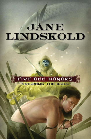
This is a problem readers are sometimes unaware of, but it is pretty common in the traditional publishing circuit. Sometimes a book is designed with no real attention to the story. In the case of Jane Lindskold's Five Odd Honors while her cover was beautiful, she admit she wasn't sure who was supposed to be pictured on the cover, since it didn't seem to look like any of her characters.
There are cases where authors honestly have little control over what cover ends up on the book shelves. I've seen covers where the image has the wrong hair color, eye color, or the image makes no sense for the story line. It's always odd to open up a book and have no idea what the image on the outside has to do with the interior. Mistaken identity covers like these are confusing to the reader, and also problematic if they are on your work. However nice a book is, it should always be an aid to the final product, not a hazard in the way.
Conclusion
Ignorance isn't bliss when it comes to book covers. 'Good enough' can be a disservice to your work. It sucks, but I will reiterate this one more time: the book industry is one of the few places where the first thing people judge you on is someone else's work. It's okay. Get a little critical. People do judge a book by it's cover.
I am one of those readers who judge a book by its cover, I know I shouldn't but I do and it's the cover art that draws me and then the title and if I like both I look to see what the description says...if it looks good I'll see if I can get it in digital format before buying.
ReplyDeleteI think part of it stems from the fact there are SO MANY books out there. Readers have to take a glance of hundreds of covers and start picking what looks interesting. If I went down the line in the bookstore and picked up every book and read the first chapter, I would have to bring a tent and live there for a few weeks. I thinks, unless someone is directly putting a book in your hands, people are always going to judge the cover one way or the other.
DeleteI recently received 2 review copies from two different publishers and they used the same stock image and a similar looking font. I never experienced the flatness of a cover in electronic format since I use a Kindle 2nd Generation, which doesn't display the book covers, but I'm glad that you brought it up since a lot of readers seems to have problems with that as well.
ReplyDelete